

Appearance
KPI Chart
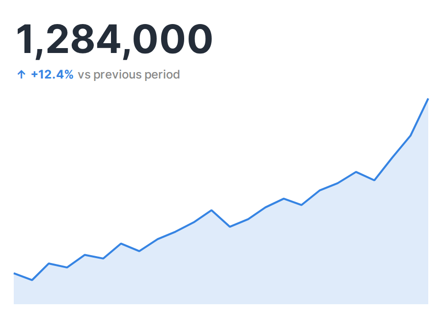
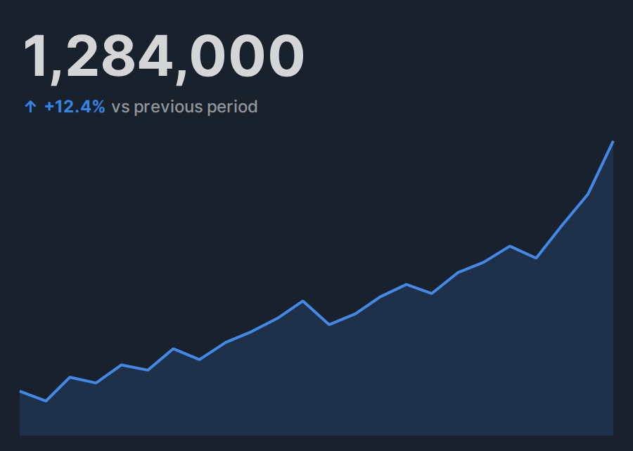
KPI Chart displays the latest value from a metric aggregated over time. It combines the metric's trend with a comparison against the previous period or previous year.
Specification
Aggregation
KPI Chart aggregates a metric for each time dimension value. The latest value in the aggregated time series becomes the chart's primary metric.
| Item | Role | Notes |
|---|---|---|
| Metric | Metric | Aggregates by time and displays the latest value prominently. |
| Time dimension | Dimension | Accepts a date or datetime column. |
| Comparison | Comparison target | Select Previous period or Previous year. |
| Positive direction | Comparison evaluation | Select Higher is better or Lower is better. |
When Comparison is Previous period, the latest value is compared with the preceding value in the time series. When it is Previous year, the latest value is compared with the value whose time is closest to one year before the latest time. The comparison isn't displayed when no value close to the comparison target is present in the time series.
Drawing types
For the trend's Drawing type, you can select Area, Line, or Bar. The default is Area.
Comparison formats
For the comparison's Format, you can select Percentage, Difference, or Difference and percentage. The default is Percentage.